SANSPAREIL
聖沛雷爾/德潔國際 CO.,LTD
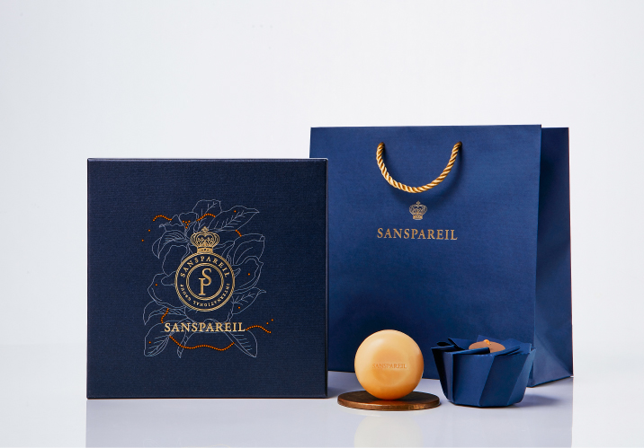
品牌定位溝通:SANSPAERIL源自於法語“無與倫比”的意思,品牌核心以極致美好的清潔用品體驗為訴求,倡導秉持著呵護自已與大地的角度創造產品,體現出用認真態度看待生活高度的價值溝通。
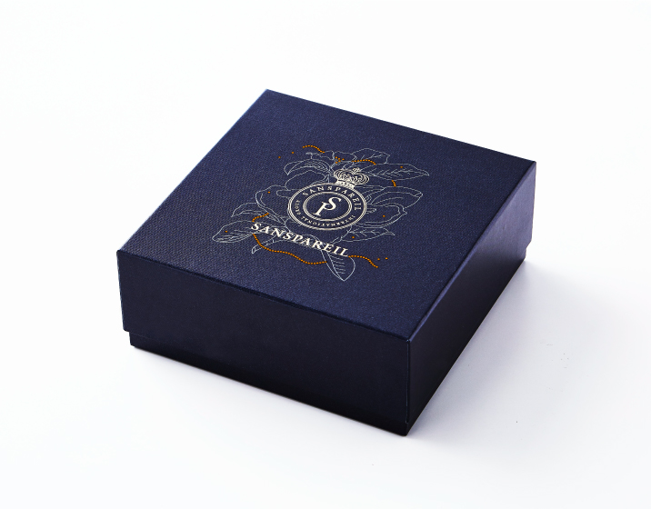
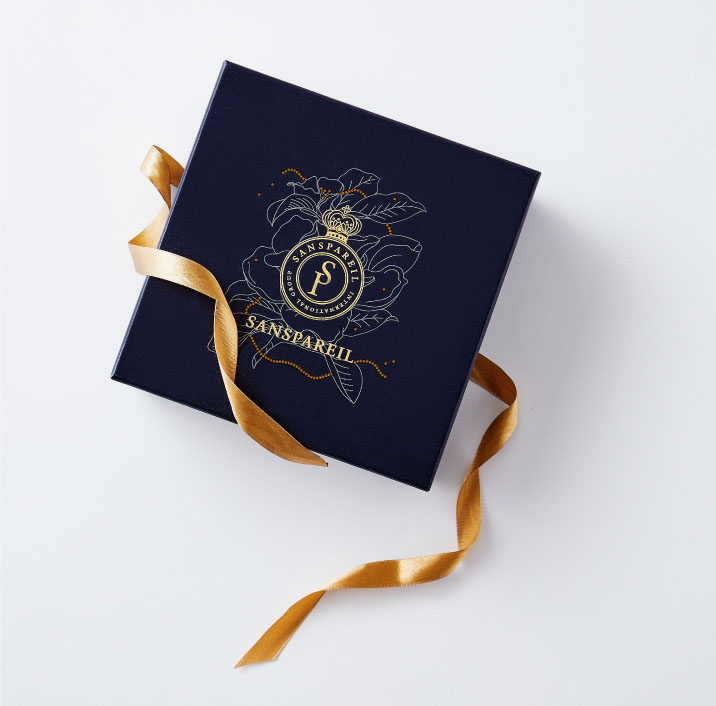
品牌形象策略:品牌識別形象以皇冠作為無可取代的尊貴象徵,通過VI設計將企業思想以可視化形式加以展現,融合品牌縮寫名稱勾勒如同皇室家徽般的視覺,展開品牌識別設計系統的整體形象規劃及運用。
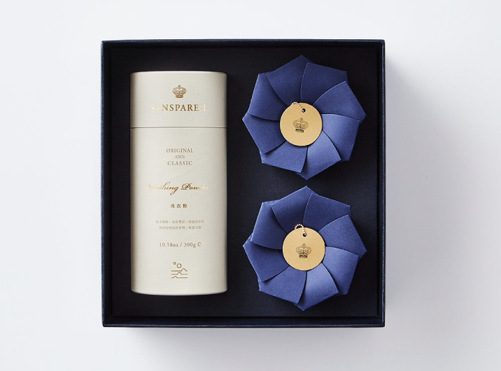
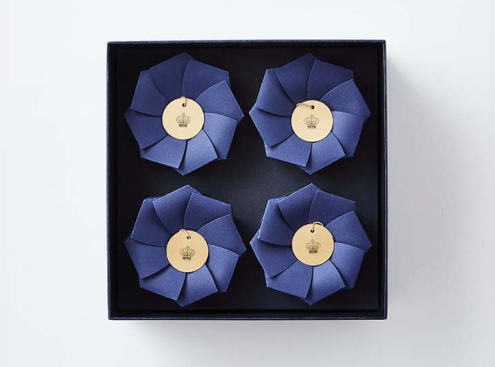
包裝設計概念:量身打造最適合手心的圓形香皂,希望傳遞溫和包覆的體貼與守護。採用單張結構式的花苞摺紙包裝,開啟時呈現盛開花朵般綻放姿態,並同時散發獨特迷人的清淡芳香。禮盒視覺以品牌識別為主體,讓其置身於華麗雅緻的花卉造型之間,透過內斂沈穩的深藍色調,營造低調奢華的纖細品味。
Brand Positioning Communication:SANSPAERIL is a French word meaning "unparalleled."The core value of the brand demands the ultimate cleaning product experiences,and the products are designs from the perspectives of care for the people and the earth to reflect the high-value communication of viewing life with a serious attitude.
Brand Image Strategy:The crown is used as an irreplaceable symbol of honor for the brand image.The VI design visually illustrates the corporate concept by outlining the abbreviation of the brand in the shape of a royal emblem as the overall plan and application of the brand identity design system.
Package Design Concept:The round shape of the soap is designed for the best fit in the palm in hopes to convey the care and protection of a gentle coating.The single flower bud origami sheet packaging showcases the splendor of a blooming flower and the unique and charming fragrant when opened.The gift box focuses on brand recognition and positions the product amidst the gorgeous and elegant flower design.The Restrained and calm dark-blue tone creates a refined taste of low-key luxury.